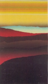
- titled: lower left in margin, in pencil
- signed (underlined) lower right in margin, in pencil;
numbered lower left in margin, in pencil; printer's chop and
copyright in lower right corner
- medium: 16-piece collagraph using 12 colors with 3
blends; proofed by Robin Brock at Pentagraphics South, Riverside,
California; printed by Katherine McPherson at Pentagraphics, North
Hollywood, California; final varnishing at Wasserman Silkscreen,
Santa Monica, California
- dimensions: image size: 42 7/8 x 26" (108.9 x 66.0 cm);
sheet size: 49 5/8 x 32" (126.0 x 81.3 cm)
- edition: 150 prints, 5 archive proofs, 15 artist's
proofs, 12 hors de dommerce, 3 printer's proofs, 1 publisher's
proof; all on Stonehenge paper
- date published: 1981
Personal Reflections, by Arthur Secunda
I often think of poet Clayton Eshelman when I look at my
intaglio print A Clear Space. Sometimes a sensitive stranger
to the work of art can approach it from an obtuse view and find a
depth of meaning in it that the artist didn't know he intended.
Whether this is speculation or the result of a sort of focused
demon inside some viewers that is able to dig out and scoop up a
kind of archetypal history to which the artist is oblivious, is
anybody's guess.
While its certainly true that I happen to work in"
of tones and colors - overlapping planes that normally begin, in
the formal sense, from the back and work their way forward, I
rarely end up with the result I intended as the work develops to
completion. The element of surprise is not only the art experience,
it is part and parcel of the process we call "creation." For me,
the point at which there is no surprise (or problem) in the
creative act, is the point at which (at least in my mind) the
artist either becomes an artisan, a carrier-out-of-plans, or a
"finisher." The multitude of varied paths attainable at any
juncture in the act of creating new imagery, would surely boggle
the mind of a layman unused to untethered improvisation and trust
in ones feelings on the unchartered road of imagination and
fantasy.
Through his astute analysis, Clayton Eshelman was able to lead
me to an understanding of the diabolical Orpheus-like worlds that
A Clear Space makes reference to. He says, "....what I
originally made out as a landscape was also an accordion of
chromatics, a kind of bellows being worked by an underworld on each
side. The way that colors exchange batons suggest that Secunda is
at play in the fields of Hades." Clayton's essays on my work of
this period remain, to this day, the most poetic studies of this
midnight side of my nature.
No doubt, the black and red blends, torn and shredded from
pre-silkscreened papers (printed by Wasserman under my direction),
and the structural simplicity of the composition in the collage,
assured the basis for the strong colors and vivid mood in the final
version of the print itself. For some mysterious reason, however,
possibly due to rolling up ink on such large plates, a strange
"golding" took place above the bottom black shapes weeks after the
print was dry and ready for curating - a ghost-like testimonial to
the work's otherworldliness. The carefully positioned blend in the
sky leads one's eye towards the picture plane instead of away from
it, and tends to solidify each shape into a sort of roll as if
squashed through the wringer of an old washing machine. This
"tightness" or "clarity of form" is why I named the piece A
Clear Space, and signifies, for me, its hidden meaning.
|


